TechSee Live
TechSee Live already existed, built before Zoom and Google Meet set the patterns everyone now expects from a video call. I led the redesign that caught it up.
Led the UX for the redesign, working closely with a junior product designer and a product manager
A junior designer, a product manager, and a dev team
Session connection, the live video session, the capture and annotation tools around it, and the history view
Shipped as Live 3.0, but only to new, smaller customers, not a full rollout across the existing base. Became the foundation later products built on: Sophie AI, VRA in Salesforce, Connectivity Guru’s agent view
TechSee, around 2022
The interface predated the products that set the expectations
The interface predated Zoom and Meet, the products that quietly set what everyone now expects from a video call. Its responsiveness behaved badly across different screen sizes, and it put complex information on screen all at once instead of when it was actually needed.
The goal wasn’t novelty. It was to align the interface with the conversational tools agents already used every day, and to clean it up: show less on screen at once, and surface only the information relevant to whatever the agent was actually doing. It also needed to work across whatever CRM a client had it embedded in, with minimal reconfiguration. We built it on MUI, the same design system running across TechSee’s other products, rather than a bespoke component library.
Getting the customer online
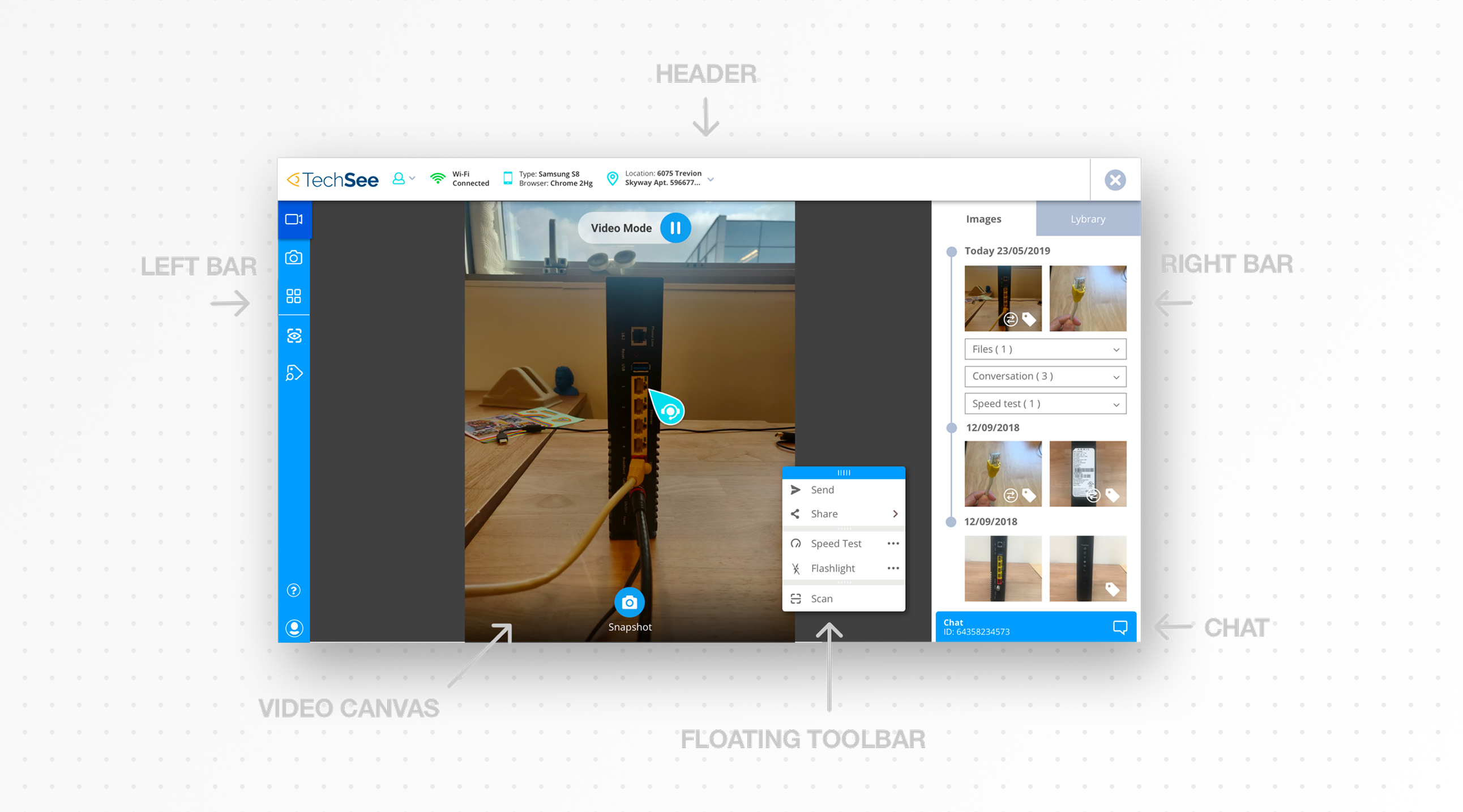
Before any video starts, the customer has to say yes, several times: to an SMS link, to a terms of service screen, to camera and microphone access. We wanted the agent to see connection status directly, not discover a failed session after the fact.
The redesign turned that wait into a checklist: SMS sent, link clicked, terms approved, camera and microphone granted. Next to it sits a live preview of the exact screen the customer is looking at right now, not a description of it. History from earlier interactions with that customer is visible before the session even starts, so the agent has context the moment the call connects instead of building it live.
The workspace
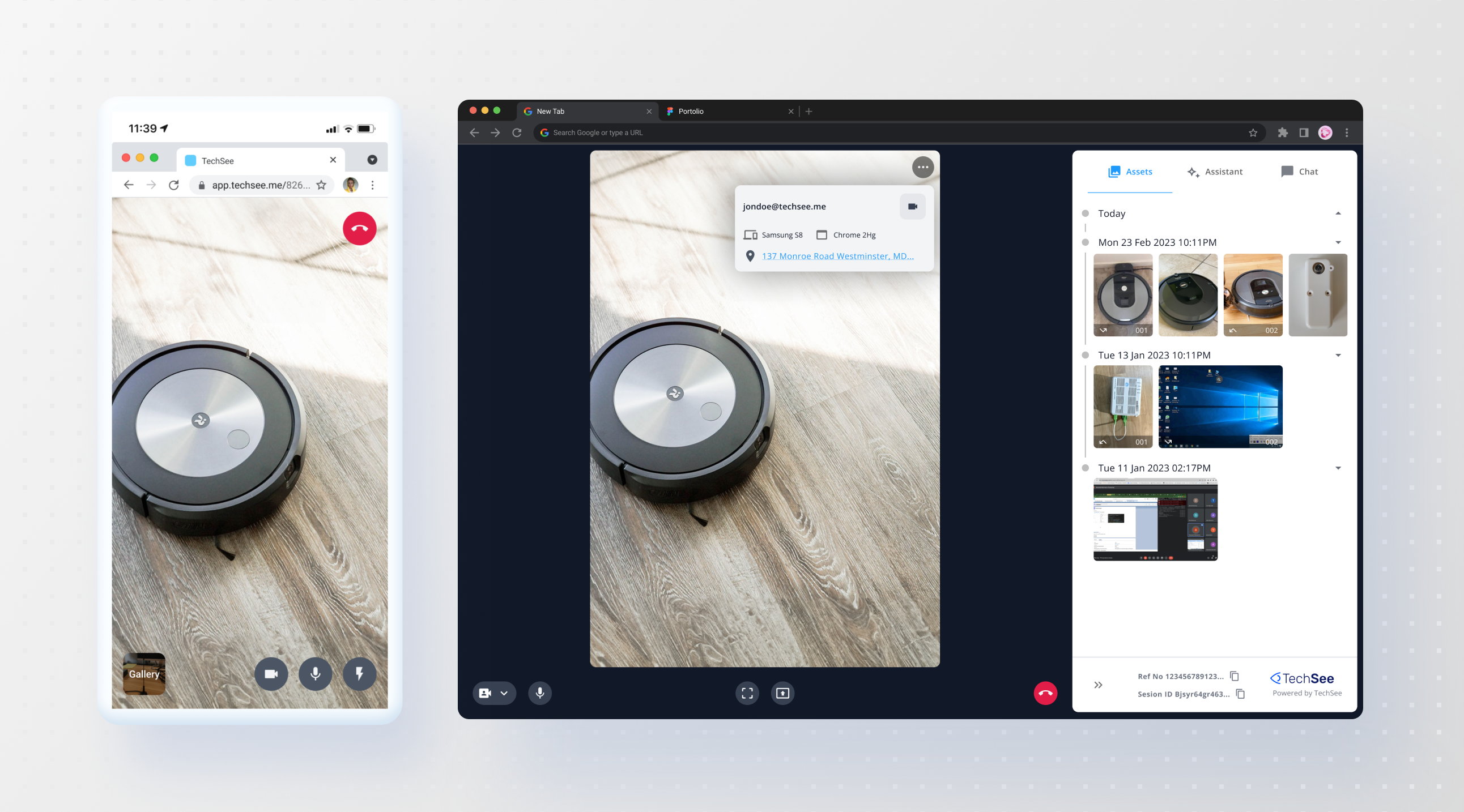
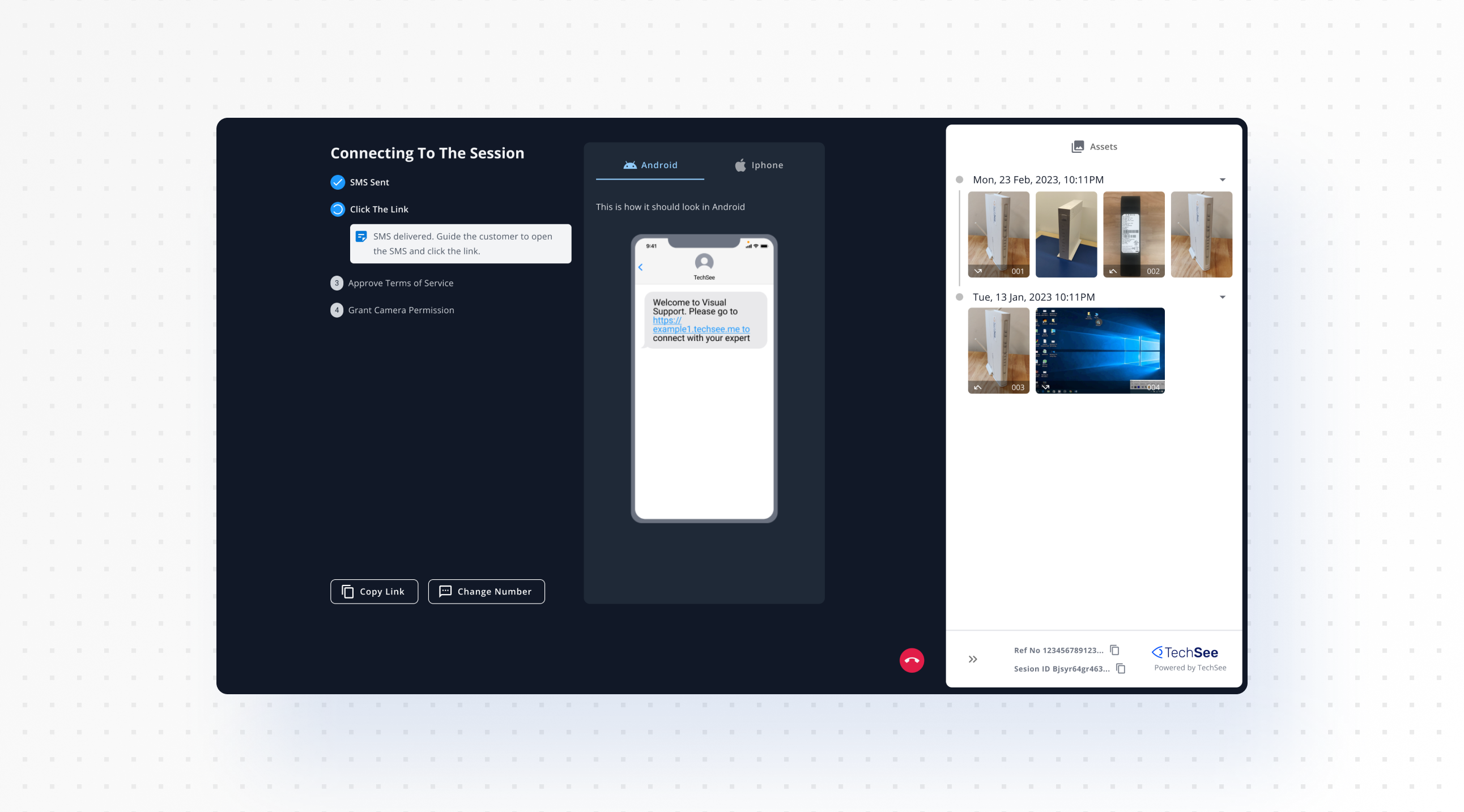
An agent opens a live video feed from the customer’s phone, captures what they need with a snapshot or a scan, and works from three tabs: Assets, Assistant, Chat. Every past session for that customer sits in the same view, grouped by date, so picking up a repeat call doesn’t mean starting from a blank screen.
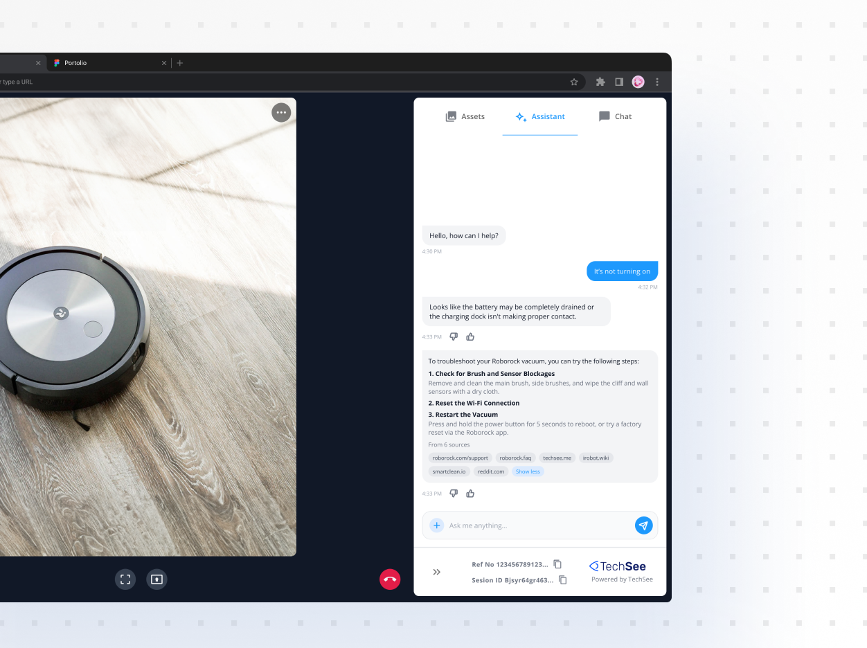
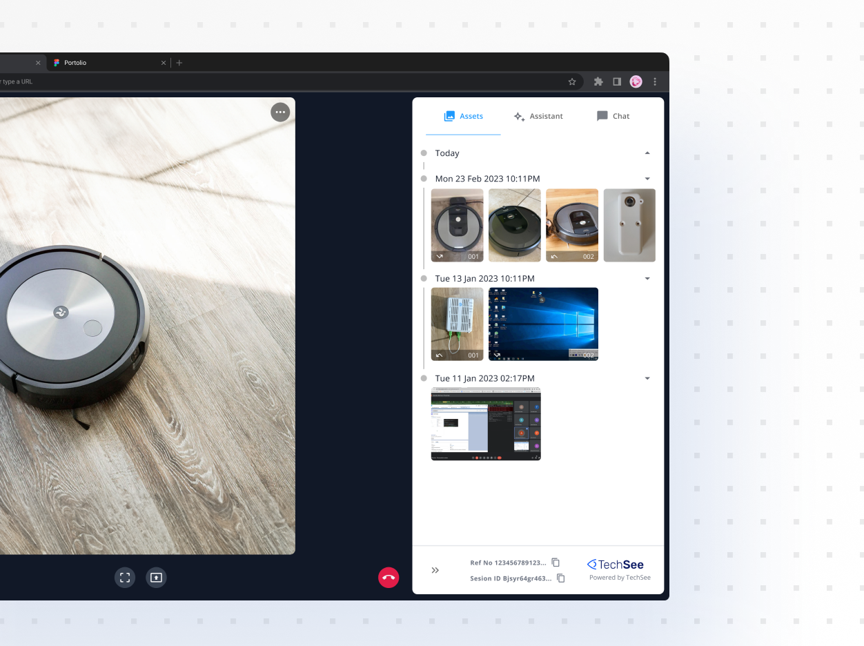
The right panel isn’t fixed
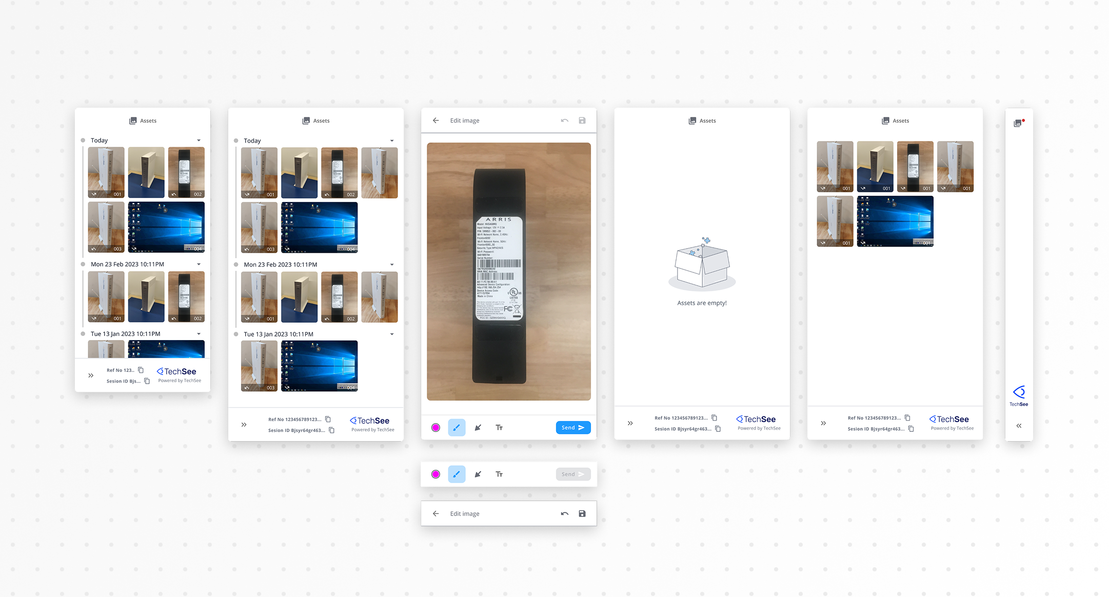
A panel like this rarely shows up in its ideal state. Most of the time it’s holding real history, sometimes it’s empty, sometimes an agent is elbow deep in a single image, and sometimes it needs to get out of the way entirely.
Populated, empty, mid-edit, collapsed: four states, each designed on purpose rather than left to default.
What testing changed
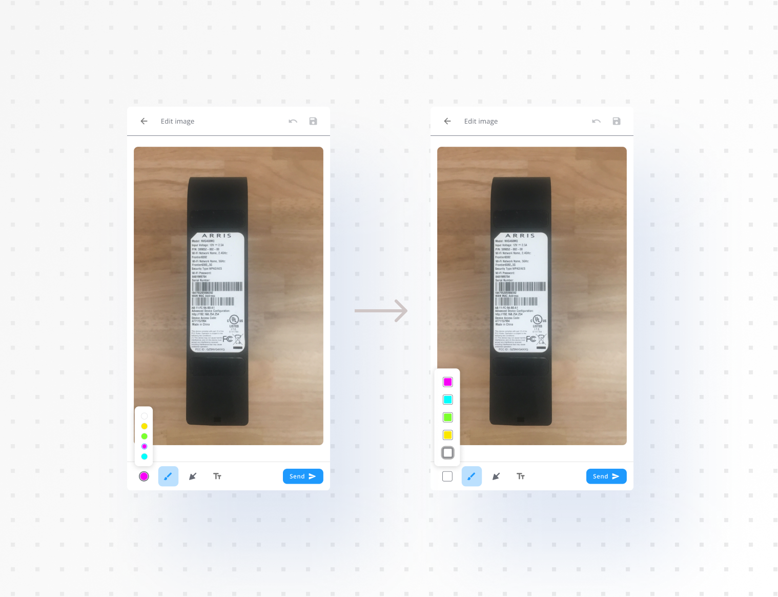
Two fixes came straight out of in-house usability testing. Session and customer info was cluttering the screen, so we tucked it behind a single overflow menu instead of leaving it all visible. And the annotation color buttons were too small to click reliably, so I increased their size after users complained they kept missing the target when choosing a color.
Neither was a guess. Both trace back to specific complaints from people using the tool.